
This is a quick post about the physical book itself: the Artefact [> 151] that is Studio Properties.
I’m not exaggerating when I say that we spent a long time designing the book. From the start we wanted a book that could be used; that spoke to a design audience; and that was a design Artefact [> 151].
And I really think we achieved that.
Here’s a few highlights.
It just looks good, making it feel good
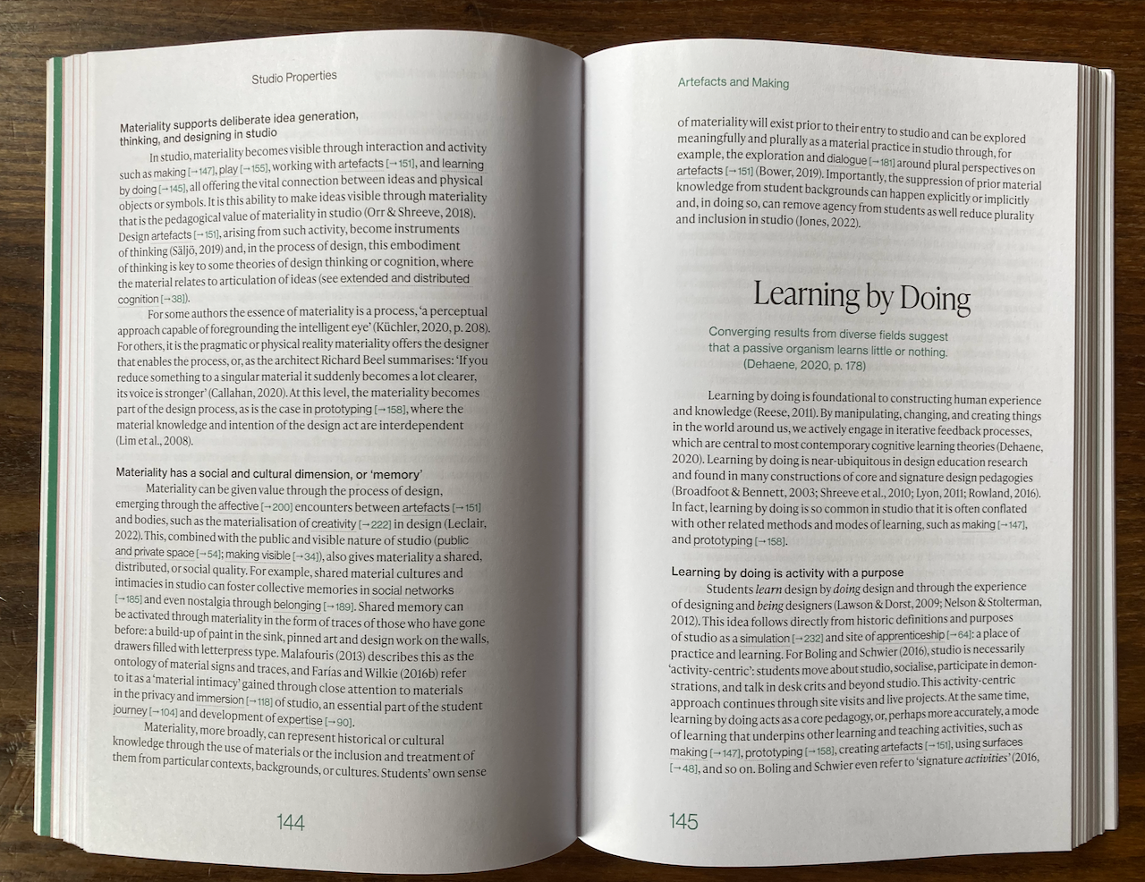
Some of the layouts are just stunning examples of that magic that good typography, graphic, and layout design come together.
They allow space for the type, text, headings, and all that other stuff that makes up a book (this is Page Furniture according to a fellow author … /cough). Studio AW–AR Studio were just awesome at this all the way through.
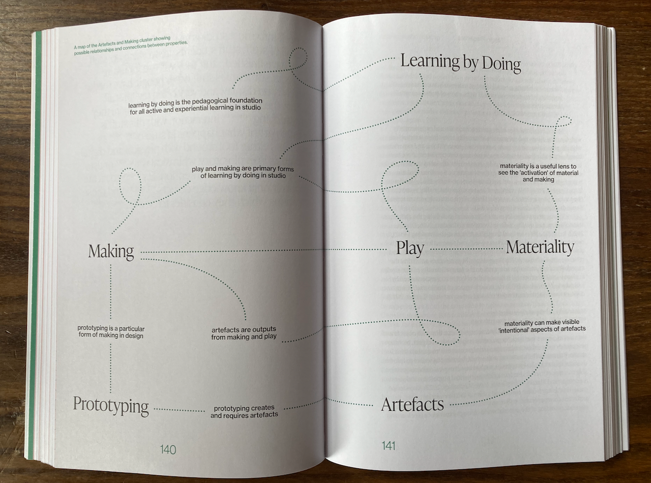
Proper book designers are worth it. Who’d have thought.
It has utility through design
The book has materiality [> 142] that has been used to make it look great but also have utility through design. Again , this was something we really wanted to happen – it’s a complex book that also must be useable.
That’s achieved through good design.
For example, the way the pages fan and give a clue as to the big structure of the text is lovely. We’d had a notion of doing this from the start but the designers have pulled this off really nicely without it screaming at the reader or getting in the way.
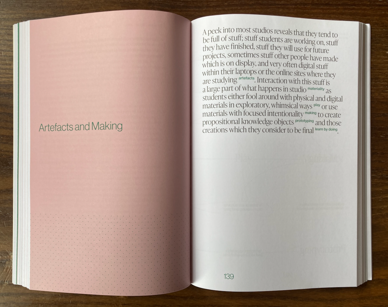
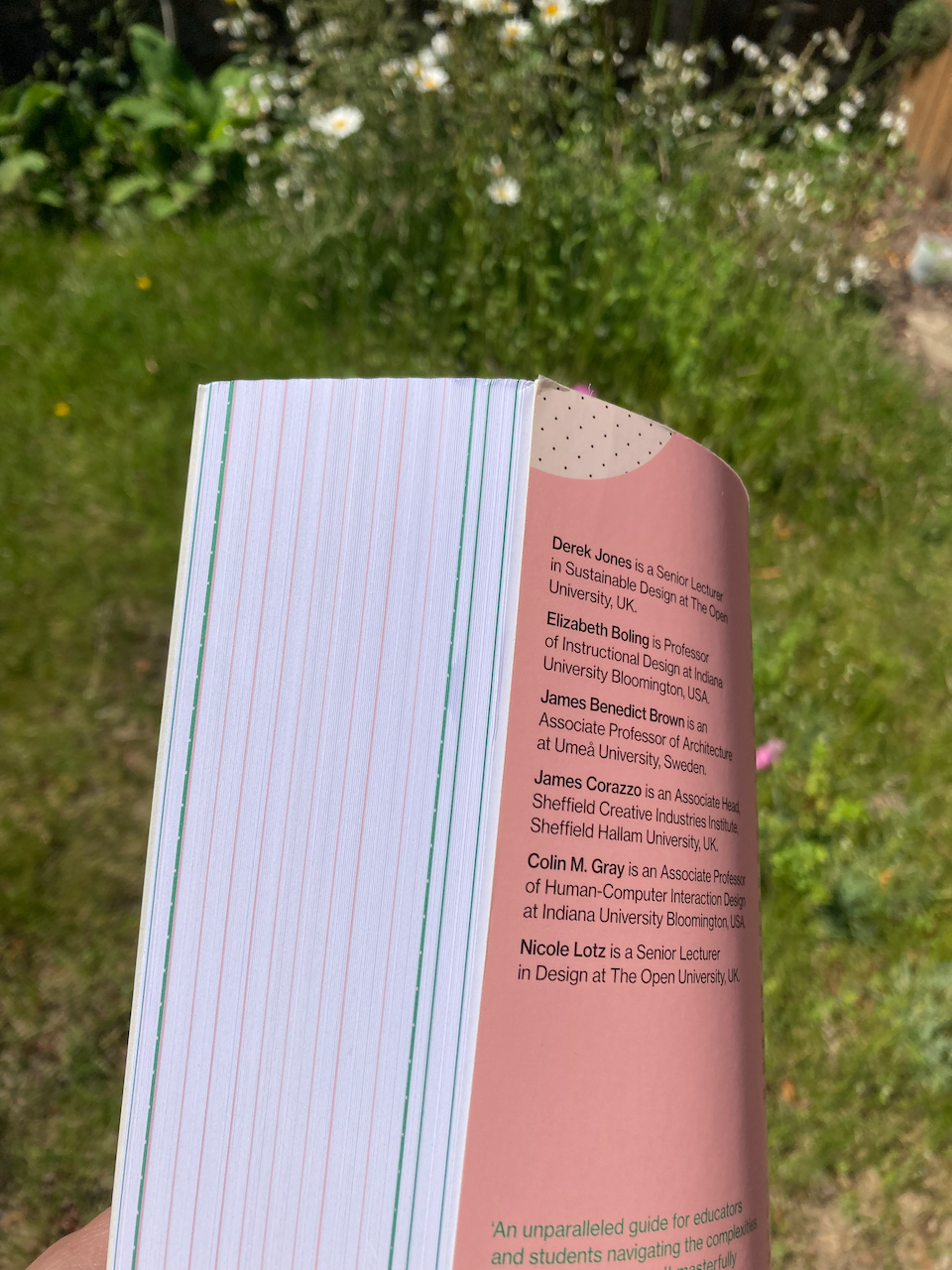
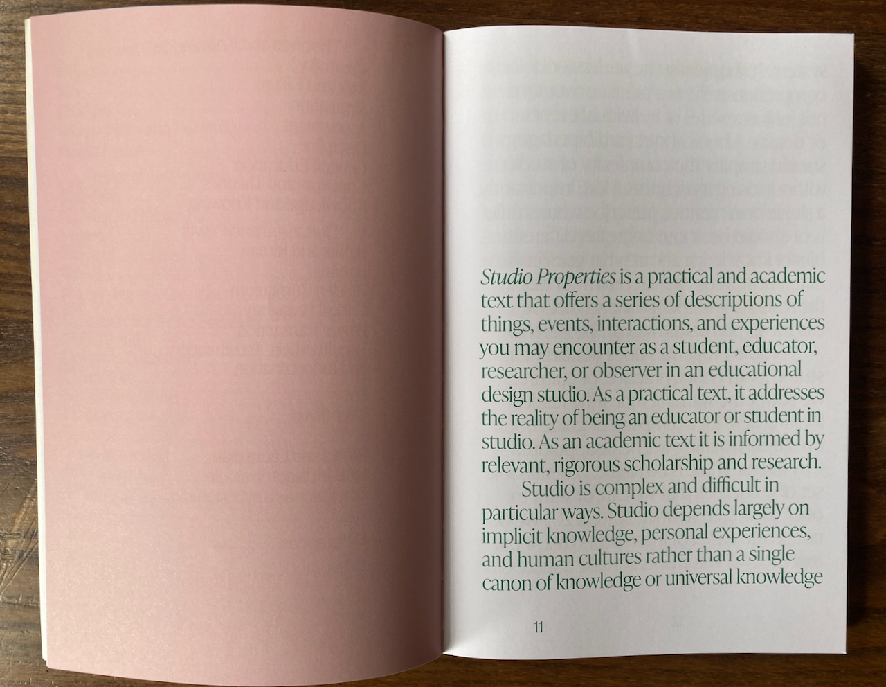
That subtle pink that emerges when you flick through Studio Properties is tasty.
Did I mention that it just looks good?
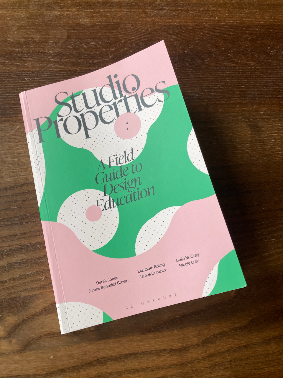
Speaking of tasty, that pink on the cover is absolutely lickable.
This is my word and both my fellow authors and spell checker do not like me using it. But I’m with the late Steve Jobs on this: making the book edible makes it touchable; acceptable; and delicious. (my only slight sadness is that the custard and rhubarb colour scheme I voted for was unanimously rejected… I defy you, enemies of progress!)
Studio Properties is visually edible and digestible.
It feels meaty
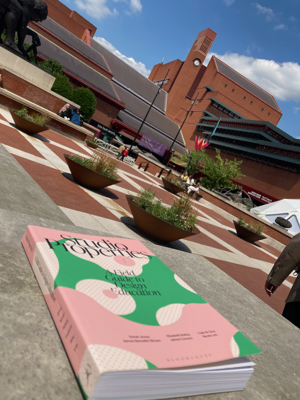
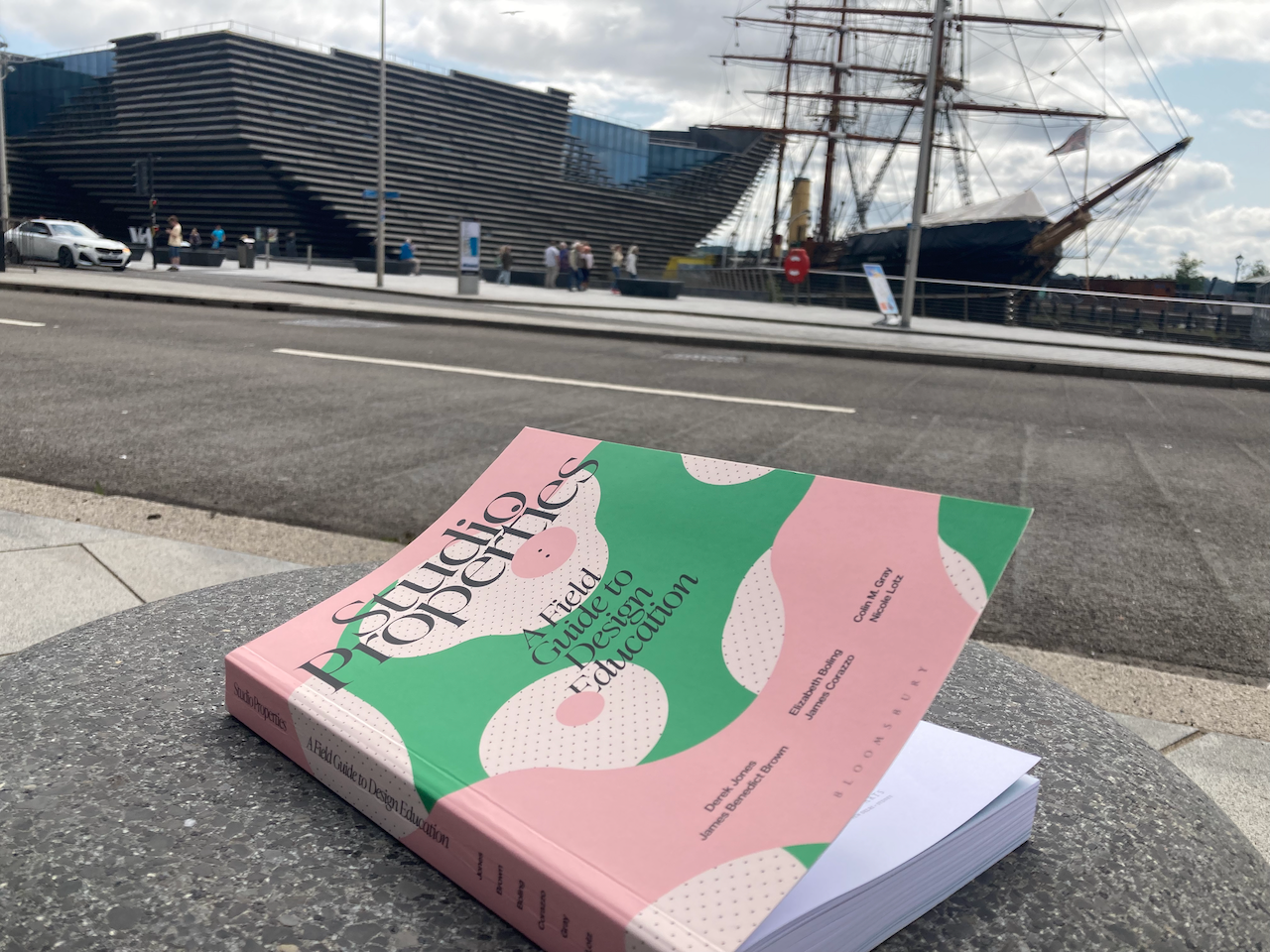
Finally, I’d like to talk about heft. In the context of book design, I’m going to trademark the term Heft ™ as “The appropriate weight for a given set of content in a given knowledge context”.
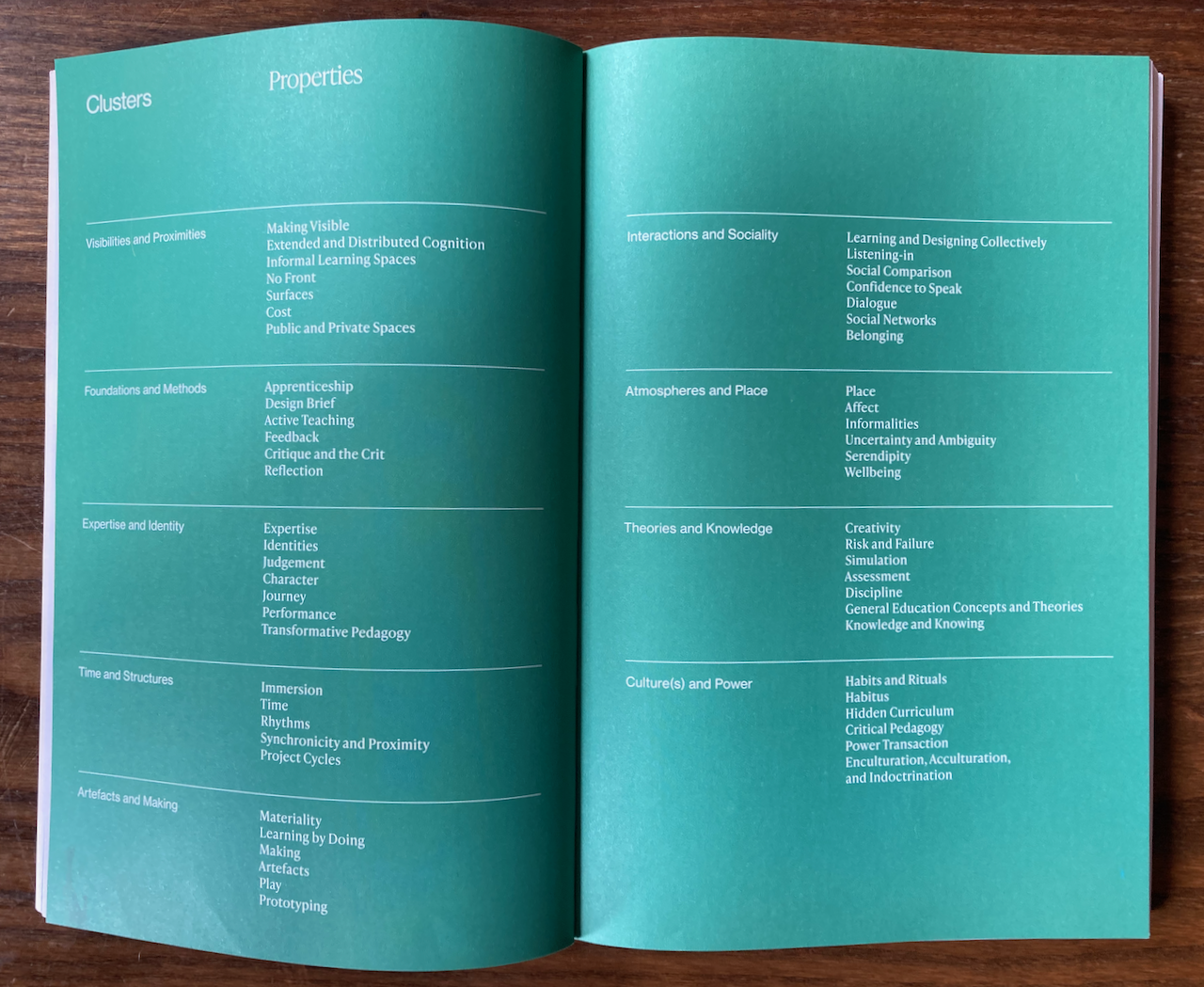
We had well over 100 properties at one point and, besides the wonderful Bloomsbury pointing out the 7 volume absurdity of this, I am glad we ended up with what we did. It’s a perfect starting point because it’s just right: it’s a lot of material but it doesn’t feel like too much (and I really love the spine design…).
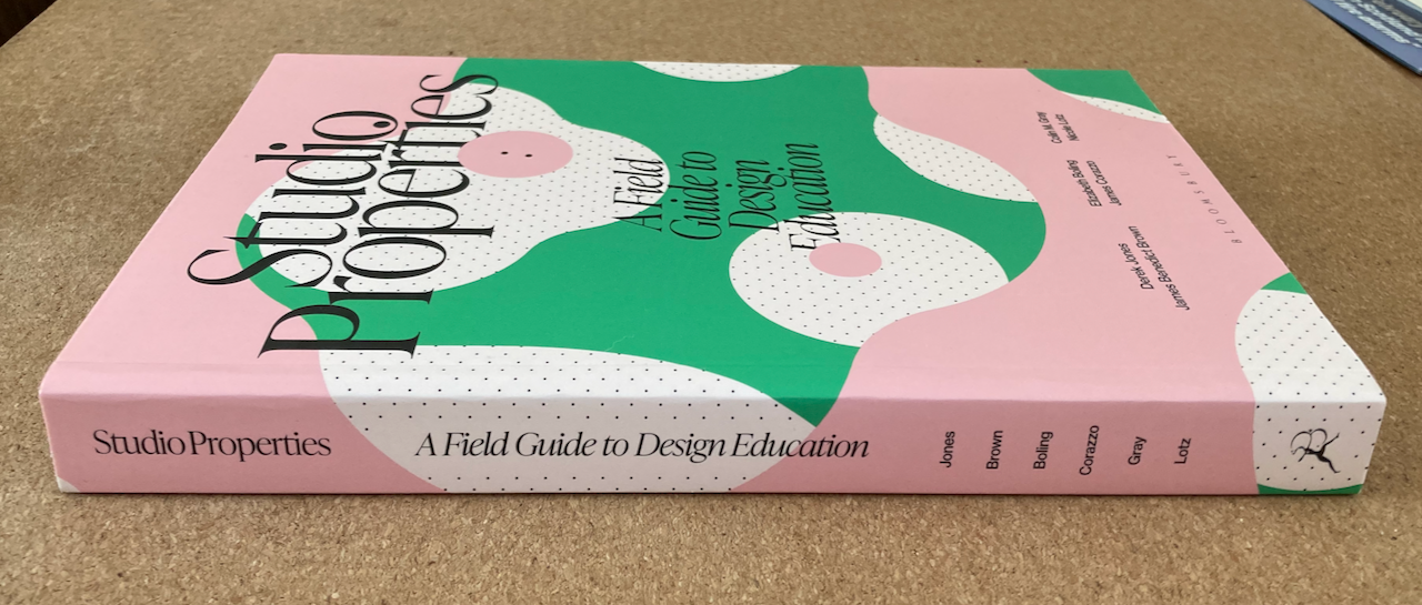
Studio Properties has a Heft (and Girth) appropriate as to its position in design education research…
OK, that’s probably enough now. I can hear the other authors at the door, begging me to stop typing and step away from the laptop.
Buy a physical copy of the book if you can to truly appreciate the tastiness, digestibility, and heft of Studio Properties!
Studio Properties is available to pre-order from Bloomsbury.